The Making Of The Ringclimber Illustration


This page has a lot of graphics - please be patient...
The Ringclimber illustration is an excellent example of the complexity and multiplicity of the techniques required to create digital art. Images from the public domain, drawn images, 3D models and textures, painting, image repair, colorizing... all of these were used.
Artists don't usually show the compositions that don't work, but here you can see a couple of versions of this illustration that went into the trash. The ability to retain and even to later modify abandoned versions of artwork is one of chief distinguishing factors of digital art compared with conventional techniques.
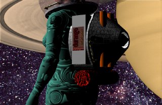
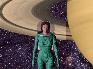
The objective in creating the illustration was to provide the reader with a clear picture of many of the elements of Ringclimber, including the appearance and nature of the rings, the look of at least one of the characters, and the style of their space equipment, all of which would assist the reader in visualizing while reading. Because the Rings contain a number of complex features which are essential to the story, I quickly rejected the idea of simulating Saturn and the rings for this first illustration. I also rejected the idea of showing the characters actually in the Rings for the primary illustration, because I wanted to establish for the new reader the exact location of the important events.
So join me in the sequence of creation...
| I looked through about 20 photos before
selecting this one as the best overall view of the planet and Rings. As provided by NASA, this photo leaves a lot to be desired. The image is greyscale, and covered with the little dots of alignment marks. There are no stars in the background, which may be realistic, but is hardly what viewers will expect. |
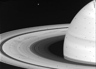 |
| Here you can see a closeup of the alignment marks, and you can even see that there are some other marks (usually due to data transmission or reception errors), which are a little less obvious, but will also be a problem. | 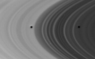 |
| By copying an area of the Rings just above or below and slightly to one side of the alignment mark, I can use that "brush" to cover the defects. | 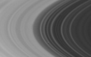 |
| Here you can see a closeup of the final defect being fixed... | |
| First, the brush is copied from a neighboring part of the Rings. | 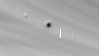 |
| Next the brush is moved carefully to cover the defect... |  |
| With the rings fixed, I have a good looking greyscale Saturn. | 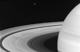 |
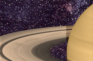
| With the defects patched, it is time to
tint. Saturn has a much lower contrast and saturation than Jupiter (due
to a persistent aerosol haze in the upper atmosphere, and perhaps due to
the lower temperature at this distant orbit), so the tint needs to be delicate.
I chose a more saturated tint for the planetary atmosphere than for the
Rings, to emphasize the distinction between them. I also added a shadow cast by the planet across the Rings, to suggest the approximate lighting I intended to use. As mentioned, a problem with NASA photos of this sort is that they have no starfield. So I found a starfield image and loaded it in the alternate buffer of the paint program. A rub-through flood fill put the starfield in the areas around the Rings and the planet by copying the content of the alternate buffer into the black background. Unfortunately, the Rings are thin enough that at least some areas would allow stars to be seen. For those areas, I did an outlined area fill from the alternate buffer, with only a partial mix of the image from the alternate buffer. This gives the illusion that you are actually seeing through the Rings to the stars beyond. |
 |
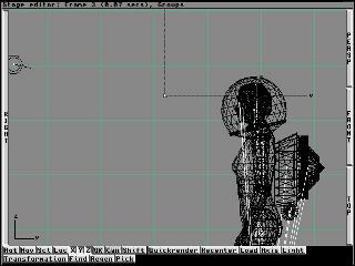
| Next came the design and construction of
the character. I was able to rely on the excellent "Humanoid" object for
the basics of my character. However, I needed first to work on determining a good look for the suit. So I spent a day experimenting with textures, and finally hit on one which had a very strange ribbing that could be construed as representing the advanced prosthetic technology described in the novel. I simply applied this to the surface of the body, though it might have been more accurate to have slightly inflated the size of the body to compensate for the thickness of the suit. A lot of things were designed that don't show in the final illustration, including a detailed manuvering and store-carrying backpack whose thrust vector is reasonably oriented on the figure's center of gravity (the backpack also has a cool bumper sticker). At this point, not really knowing how the composition was going to turn out, I decided to just be as detailed as possible, which would leave my options open, and also allow me to reuse the figure in later compositions. |
  |
| Next, it was time to work on the helmet.
The helmet ring was fairly easy, just a hollow metallic ring. The helmet
glass, however, needed some special treatment to show the heads-up-display
used for orientation, navigation, and keeping track of the others. I started
with the drawing. It had to be kept simple and clear, because it was going
to be a small area of the final artwork, and also because it had to leave
a fair amount of helmet area available for the characters to see through.
It took a couple of drafts to come up with something that seemed to have
the right set of displays, which included tracking the others, orienting
on local objects and more distant stars, attitude control, and suit status. The HUD was going to be mapped on the outside of the helmet. That meant it had to be mirrored horizontally, so it would show the right orientation if viewed from the inside. Then I applied it to the transparent helmet globe as a filter map, inverse videoed (i.e. color complimented). The helmet, though transparent, was made a bright object, which made the HUD luminous, while not affecting the transparency of the glass. A similar map was applied to show the name of the character. I assumed suit color would be used for visual ID, but people would want to find their own helmets, and it would also be useful when characters were in reasonably close proximity. It is also worthwhile to note that I needed to provide a reflection of the environment for the helmet, because the bright starfield would certainly reflect. The Saturn image was in the background and would not reflect toward the foreground viewer. So I reused the background starfield and mapped it onto the surrounding environment so that it would be reflected by the helmet glass and any metal on the suit. |
  |
| With this done, the face was the next area
to focus on. I colored appropriate parts (such as eyes), and then had to
turn to the hair. I hate hair in 3D, because the geometry is so complex,
and the fluffy surface of hair is not directly available in 3D. I made a
first cut at the shape and texture - and then decided to try various compositions. Each rendering takes an hour or more, even without cast shadows. Cast shadows are much more expensive in rendering time. Posing the figure in front of the backdrop for maximum effect is the key difficulty at this point. It is possible to make decisions with fairly crude renderings. Once a satisfactory result is obtained, the detailed rendering is done. It became clear that the image of Saturn was not going to work in the original orientation, so it was flipped vertically. That somehow seemed to guide the eye much more smoothly through the possible compositions. |
 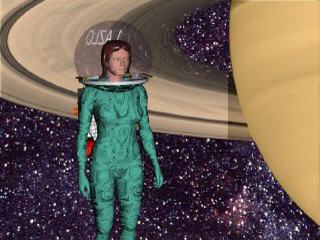 |
| I ended up dissatisfied with the more distant
views of the figure and finally settled on the closeup view. But that meant
the face and hair needed significant improvement. The hair and face were just not personal enough. I picked cheek points and scaled them in so as to provide a leaner appearance. Then back to the hair and a lot of different efforts to arrive at the final (satisfactory) result. In the detailed rendering, it happened that a cast shadow (not visible in the scanline rendering, because cast shadows are not generated by scanline) of a circle from the HUD was projected right on the character's face. I spent a lot of time looking at it, trying to decide if it added realism or was a distraction. Once I had decided it was a distraction, I had two alternatives: paint it out by hand, or move the light source. Moving the light source was dangerous, because it could unpredictably affect everything else. But hand painting would reduce the realism in this instance. I elected to move the light. First, I backed everything up. There's nothing worse than moving a light and not being able to put it back where it started when the motion ends up being too much. Then I started a tedious set of move, render, move render. But it didn't take too many to get the shadow off the face... and, voila! Done! |
|
I hope you've enjoyed this trip through the creation of an illustration. As you can see, it can be a complex and tedious process with false starts, mistakes, and obstacles. But when the result works well, it is more than worthwhile.
And it only took a week...